
In prior decades, economic growth and emissions co-existed. As countries grew richer, they produced more and emitted more. This relationship formed the assumption that there is no growth without environmental costs. However, in recent times, this trend started to shift.
We started advocating for sustainable development, certain that, with modern technologies, it is possible to eliminate the carbon trade-off of growth. Right now, it is crucial to ask ourselves whether we were able to achieve that. In other words, are we breaking this historical link between carbon and wealth?
Using World Bank Data on GDP per capita and emissions per capita, this article examines the correlation between economic prosperity and emissions. GDP per capita is an accurate proxy for economic development, while CO2 per capita is the standard for measuring emissions. If emissions are still vital to economic growth globally, we’re hardly making any progress. If correlation drops, green growth is achievable. Finding out which one is closer to reality is the first part of this analysis.
It is crucial to note that when analysing data by region or country, it is possible to overlook a potential shift in the emission-heavy production. This shift occurs because most statistics on emissions focus on where emissions are produced, not the end consumer. To prevent this, we need to distinguish between territorial emissions and consumption emissions. This distinction can show whether we are reducing emissions globally or shifting them. It is the focus of the second part of the analysis.
Are we breaking the link on paper?
It is quite a complicated task to show a graph that instantly indicates whether there is a global correlation between GDP and emissions and whether that correlation has changed over time. The main challenges are extreme outliers and the scale of global production earlier and now. To show it as accurately as possible, it is necessary to cap outliers to prevent skewing the graph, group by 10-year periods, and combine three graphs into one, leading to the final result.
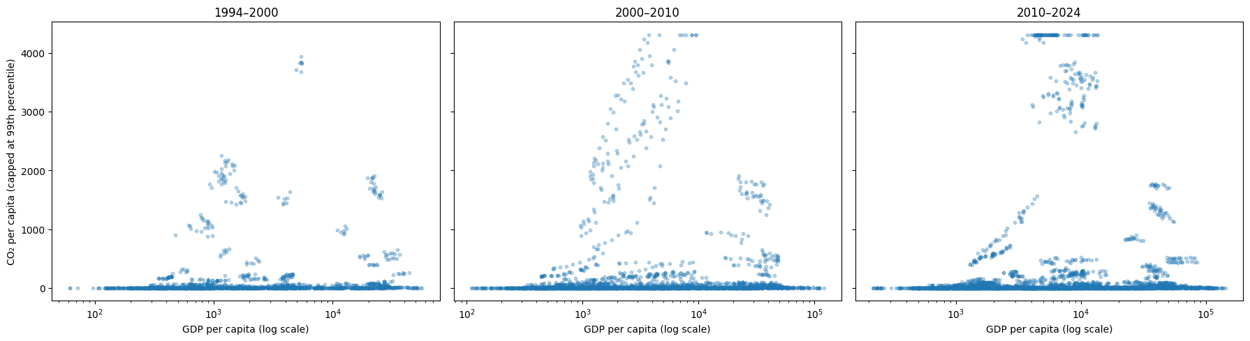
In earlier years, wealthier countries led in emissions, as few developing countries emitted much. Higher emissions were concentrated among industrialized, wealthy economies. Towards the 2000s, the overall trend began to change: the countries that emitted a lot became much more scattered. Finally, in recent years, there has been a wide horizontal spread at the top between various wealth levels.
Countries with similar income levels show very different emissions, and it depends on how economic growth is achieved — through carbon-intensive production or cleaner practices. In the 1990s, however, wealth and emissions were still correlated: richer countries emitted more on average. While there were already ways to grow an economy without relying heavily on emissions, such cases did not yet define the global pattern. Over time, countries at similar income levels begin to show different carbon footprints. The correlation drops:
The range of change in correlation is narrow: from −0.06 to +0.06, making changes appear dramatic when, in general, they are insubstantial. At the same time, even such a shift means that wealth stopped being a positive predictor of emissions, and that rich countries can now grow their economies without increasing emissions. Slowly, but evidently, it seems possible to combine growth and emissions reductions.
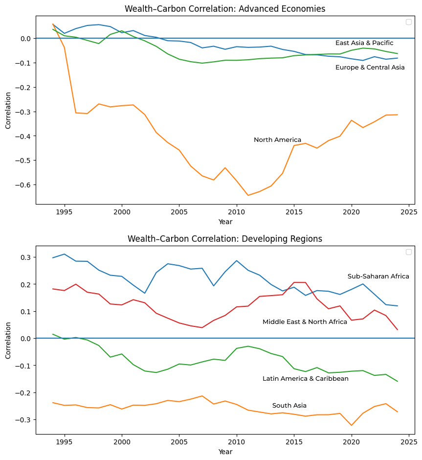
But what if we look at the correlation by regions? Regional analysis can help see if the global trend is shared across different parts of the world, and it actually paints an interesting picture:
On average, developing regions show higher correlation, but the difference is minute, meaning that it’s not the main determinant. Since no region shows a fundamentally unique trend, to see the full picture, we need to analyze not regions but income groups, or even separate economies. Apart from that, it’s necessary to look at emissions from a different angle. Within the same region, economies can follow very different growth and emissions trajectories. They may offset each other when aggregated. As a result, a moderate or low regional correlation does not imply that there is no relationship at the country level; rather, it shows that regional averages have their limitations.
Related Articles
Here is a list of articles selected by our Editorial Board that have gained significant interest from the public:
Are we breaking the link between emissions and economic growth or moving the chimneys?
The main type of emissions we look at is the territorial emissions. They are connected to the production of goods on a given territory and are usually used as a metric to indicate a country’s ecological situation. This assumption could work well in closed economies, yet it’s not ideal for a complete view of a globalized world. What if we want to see if the production emissions are being shifted to less developed economies so that the developed ones are “green” on paper?
If we want a more insightful picture, the best way to do it is to look at consumption emissions. Such data is available on the Global Carbon Project, which contains consumption-based CO2 for every country until 2022, if available. Consumption-based emissions show us the final demand and the beneficiaries of emission-heavy production.
Just looking at the distribution of consumption and territorial emissions paints an interesting picture:
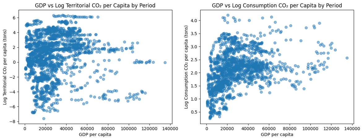
A simple scatterplot shows that there are fewer consumption-based emissions in general (Y-range -8 to 8 on the first graph, 0 to ~4,5 on the second). What’s more important is that the correlation changes, but not significantly, indicating that developed countries may not be moving their chimneys and may actually grow without a carbon trade-off.
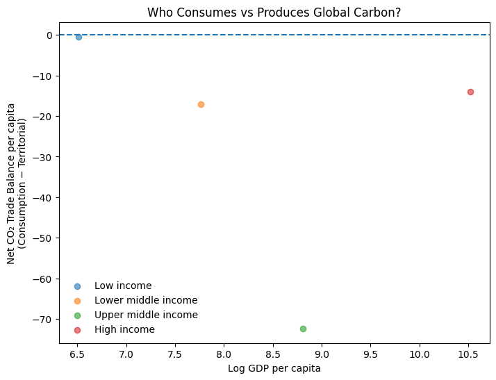
One of the most insightful metrics in this particular situation can be the difference between the two types of emissions, a CO2 trade balance. This metric shows whether a country is an importer or exporter of carbon. If it is positive, the country is a net importer of emissions, meaning it relies on emission-heavy products from other countries; otherwise, it’s a net exporter, signalling increased production for external use and consumption.
The decisive question to conclude whether wealthy economies move the production and generate emissions into poorer economies to show progress and hide the root of the problem: Is the apparent link break in rich countries explained by outsourcing emissions to middle- or low-income producers? Simply put: who absorbs the emissions?
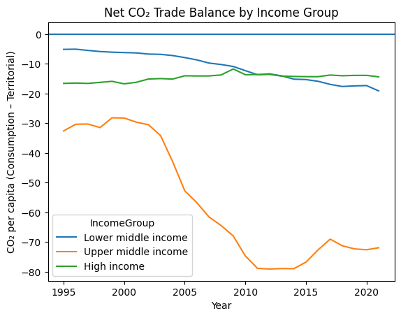
This graph shows that upper-middle-income economies are becoming major net emitters. The situation is similar in lower-middle-income economies, but the scale is much smaller.
The growth of high-income countries is even less evident. It shows the rise of manufacturing hubs in recent years, which supply the global demand.
(Note: Low-income countries are not part of the graph due to a lack of data. Estimates for them are predominantly close to zero and unreliable.)
As time goes on, we are producing more and more emissions, without even consuming them. At a global level, where emissions take place is increasingly detached from where people consume the final products. It’s important to note that consumption-based emissions figures are not as reliable in that sense. Still, the overall trend is undeniable, which explains why it’s so hard to analyze the current situation: countries omitting most emissions are not the poorest, and the situation has not changed completely. Upper-middle-income economies like China became global manufacturers of many goods. It makes analyzing the current situation so nuanced.
If we look at the last decade, the overall picture is very clear. There is a decoupling of economy and wealth, but it does not matter within a global connection in production. Upper-middle-income countries produce a huge amount of goods, which these countries export afterwards.
You don’t break the link between economic growth and emissions by moving the chimneys
Territorially, some countries are able to reduce emissions while growing their economies. It shows genuine progress at the national level for some. However, there are two main caveats to that. Firstly, there were, and still are, methods to grow a country’s economy without emissions, but not globally. It is evident that global production still relies on emission-heavy practices.
Emissions were a driver of development, and the main emission-omitters were among the richest. Currently, this dirty production is merely being shifted, while overall emissions have not declined in recent years. Finally, breaking the link between wealth and carbon requires not only greener growth for the rich but also global reforms, including changes to how we view emissions and how we try to eliminate them.
Editor’s Note: The opinions expressed here by the authors are their own, not those of impakter.com — Cover Photo Credit: Arno Senoner


